The mobile SERP is an interesting place. Despite mobile devices only being around for the last decade or so their impact on how we surf the web is immeasurable. Google has put in a lot of work on their mobile SERPs and for me, I find more changes happening on mobile than I do on desktop. In light of Pete Meyers fantastic article about measuring desktop rankings, I think it’s important to have similar conversation about the challenges on mobile devices as well since they take up 50% of all web traffic.
Rankings are one of the most useful pieces of information for many SEOs measuring performance, but seldom do we compare the difference between Desktop and Mobile rankings. We know that mobile CTR is typically much lower than that on desktop, but it’s fairly difficult to measure why that’s the case with current rank tracking methods. Without measuring anything, the differences between the two platforms is obvious: there’s just a lot less space on mobile than on desktop to display the same information. The most popular viewport size on desktop is 1366×768 which is 4.5 times bigger than the most common mobile phone size (cite source). Because of this limitation organic results get pushed down further within search results than they would be on desktop. The question is, how much farther down are mobile results pushed?
Difference in #1 Rankings
Measuring ranking positions makes this difference difficult to see, but using the number of pixels from the top of the page makes it much easier to see the differences between desktop and mobile. I went ahead and measured the pixel distances of 1,500 SERPs and found big differences between both platforms. The average #1 position on desktop was 492 pixels from the top of the page, whereas the #1 mobile position was 983 pixels from the top on average. That’s almost double the number of pixels lower than desktop! And keep in mind that the most common height of a desktop screen (768px) is still larger than the most common mobile screen height (640px).
If we think about rankings in terms of how many scrolls it takes for a user to see a number one listing then the numbers look even worse on mobile. On desktop, for most queries, the #1 ranking is above the fold and doesn’t require any scrolls. Conversely it takes one and a half scrolls on mobile to see a #1 rank on average. That’s a lot of effort for a user who could just click on a paid ad or some other SERP feature before getting to your organic ranking (assuming you rank #1 in the first place).
Largest SERP Features
SERP features take up a lot of space in SERPs. 10 years ago, there really wasn’t any such thing as a SERP feature barring an image block or two. Now SERPs are chock full of them. Anything from map packs, discover more blocks, interesting finds, etc… can take up space within SERPs. These SERP features vary in size, which means their impact on CTR to your pages will vary. That’s not to say that distance from the top of the page is the only factor that affects CTR, but it is a big one.
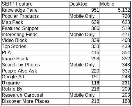
The blank spaces in this table indicate a SERP feature that exists on one device and not on the other. During my search I was able to find Popular Products, Interesting Finds, Search by Photos, and Research Carousels were all features that don’t exist on desktop but do on mobile. This is significant, considering that a feature like Popular Products pushes anything below it down 720px on a platform that’s already short of space.
Granted if you’re fortunate enough to be listed in one of these features, then you’re in a good spot. And there are ways to make it more likely to end up in some of them, but if not this is a stark reality for people trying to get folks to click on their site listing.
Incredibly, Knowledge Panels take up over 5,000 pixels on the SERPs I measured. That’s equivalent to 8 full length scrolls on a mobile device. However, as Dr. Pete Meyers mentioned in his article about how low can #1 go, for queries like these, the search intent of the searcher is most likely looking for information already within that Knowledge Panel and you’ll have better luck getting your site to rank elsewhere.
Excluding Knowledge Panels, which are a huge outlier, SERP features are 28% larger on mobile than on desktop in terms of height. This shouldn’t be too surprising since there’s less horizontal space onscreen words tend to wrap more and increase SERP feature size. In the case of organic results themselves, they’re 95% larger on mobile than on desktop which is much larger than just accounting for word wrapping. Something else is going on there.
Differences in organic listings
There’s no question that word wrapping on organic listings is a factor related to the differences in length between desktop and mobile, but there are more things at play than just word wrapping. I’ve noticed two main features that exploded in commonality sometime around Spring last year relating to Image Thumbnails and Image Carousels showing up within organic listings themselves.
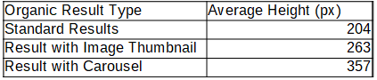
What’s interesting about these two feature types, is 1) at 357px, a organic result with a carousel is 75% larger than a standard organic result and 2) how common these features are. 25% of the organic results I checked had either an image thumbnail or a carousel. And of the SERPs I checked over half of them had 5 or more results with either an image block or image carousel. That means each of those SERPs are at least twice as long as a SERP without those features because of how much carousel and image thumbnails push down other results.
These are especially important to keep track of because they’re not as obvious as more other SERP features like a map pack or people also ask blocks which are tracked in most rank tracking sofware. I only image thumbnail and carousel here, but there are dozens of other organic features that are being added to SERPs worth tracking.
Different Layouts
We’ve already discussed the fact that desktop has far more surface area to display information in terms of height, but it also has the advantage of width as well. So things like Knowledge Panels can be pushed to the side of the screen instead of on top of everything else. It’s not just knowledge panels that are pushed on top of everything though. Product Listing Ads (PLAs) are also pushed over on top of all other features as well.
Based on the SERPs I checked, Knowledge Panels and PLAs were always placed at the top of SERPs. So it’s not even possible to rank above them. If these features are on a mobile SERP they’re going to push down your results. For PLA’s you can at least bid to be one of the products in that top spot if you’re an e-commerce website, but otherwise there’s a pretty good chance you’re SERPs will go down in ranking.
% of SERP taken up by Ads
Another factor to consider when taking into account how much clickable space there is on any organic results in SERPs are Ads. On any SERP with Ads 10-15% of that SERP is going to be taken up by Ads. This includes both Google Paid Ads and PLA’s. However, since mobile has such a small viewing space, these ads take up a lot more of the viewport than on a desktop.
Google appears to continually be looking for more places to add Paid Advertising within their SERPs over the last few years. Features like PLAs, Map Pack placements, and Popular Products are just a few examples of features that have either popped up or become more prevalent over the last few years. I expect Google will continue to add more places where they can monetize there results so keeping an eye on increases in Ads showing up on SERPs is a good idea if you notice any CTR fluctuations in your rankings.
What Can You Do
The first thing we can all do is keep an eye on these changes, because in some cases you can take advantage of some of these changes. For example, if PLA’s are becoming more prevalent in your SERPs, it probably makes sense to evaluate your Paid strategy in those areas to make up for lost CTR to your organic results. In cases where organic results have image carousels or image thumbnails popping up more than usual, you can check your site to see if there’s any way to increase the likelihood that Google adds those features to your listings to boost CTR.
Additionally, since we know how large some features are on average, if you have rank tracking software that tracks SERP features in detail use this information to your advantage. For example, a map pack is a little over 600px on both desktop, and an organic ranking is around 120px on average. So why not spend time and effort trying to move a keyword up one position for any of those directly under a map pack? That’s the same result as moving a result up 5-6 rankings if all the results were organic.
With this information you can prioritize improving keyword rankings for your site, with way less effort but similar results. It’s time that we stop focusing on rank position itself, and instead focus on how much we can move the result up the page.